How to take your own headshot like a pro!

5 Steps to a cute DIY professional headshot:
This is the sitch: you’re a plucky startup and need to show up online looking profesh. But you’re a little cash strapped. Who are we kidding, you’re broke. I feel you, I’ve been there too.
I got you, I’m going to teach you to take a professional headshot like a PRO. I’ve intentionally kept this guide simple. You won’t need to buy reflectors or anything like that. If you start buying equipment you’re never going to use again you may as well just hire a professional.
I’m also not going to lie – nothing beats a headshot taken by a professional who has been doing it for years. A great photographer brings unexpected things out of their subjects. A photographer like me. Come on you can’t begrudge me a little plug.
This guide is to get you by, you plucky little startup. Until you have the budget for Photoform* headshots (Melbourne based):
1. What to wear and how to do your makeup for your headshot?
Keep it simple. Avoid crazy patterns or if you want patterns keep it to a small part of your look like a tie or scarf. I always recommend a suit jacket for any corporate photos. It adds a nice finishing touch and creates structure in the image. Keep your look in sympathy with your brand vibe. Remember, personal branding is making sure every touch point is on message and on brand.
I won’t go into great detail here, because lucky for you I have two resources I’ve already written.
First is on my website: what to wear.
I wouldn’t wear a cap like in the headshot examples here – but this was my housemate and his hair was a mess and he couldn’t be bothered doing it haha.
Second is makeup and grooming tips on my blog post: common hair and makeup mistakes and how to avoid them. Quick summary: keep headshot makeup light and daytime fresh. Think makeup for popping out for a coffee with a friend.
2. Lights! (lighting your DIY headshot):
Without light there is nothing but darkness. Deep, right? You might have read DIY headshot guides that say to only use natural light. Not true.
But don’t mix natural light and artificial light. So if you are using natural light, don’t mix it with a fluorescent light. And vice versa. Why?
All light sources have a colour. It’s often invisible to the eye but some might be slightly blue or some slightly orange. Mix those sources and the colours get muddy. You don’t want that. You want a nice clean light for your photos.
Using natural light for your DIY professional headshot:
The best abundantly available light source is window light. It’s a beautiful soft light and it’s been used by portrait painters for eons. Think Rembrandt. There’s even a studio lighting style named after him – it’s characterised by the subject lit by a window and on the shadow side is a triangle of light below the eye. See below:
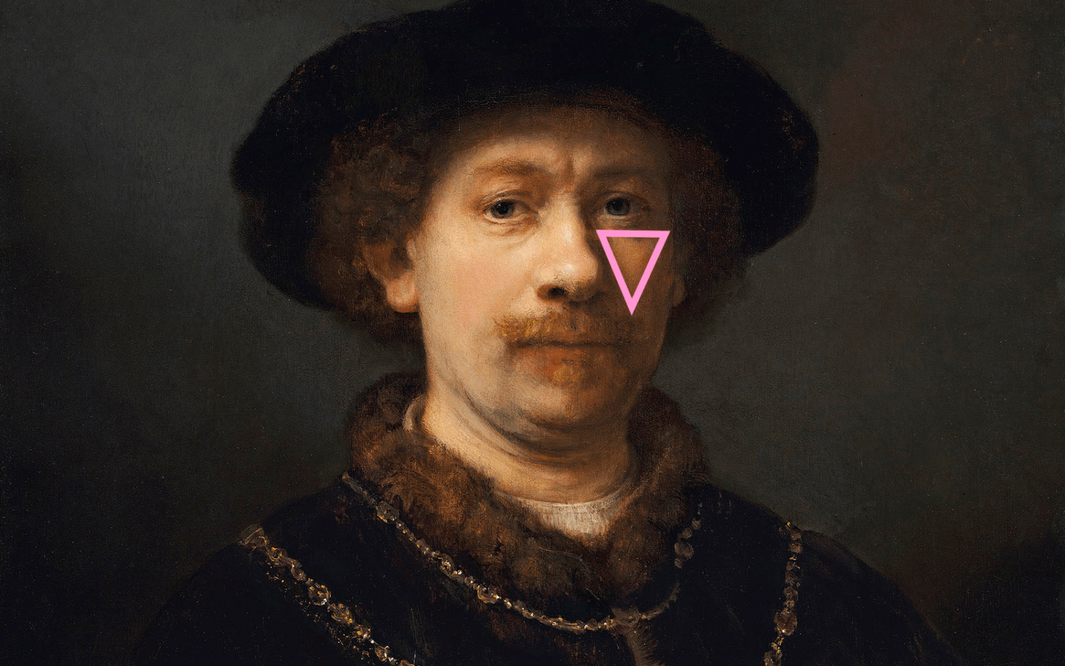
Rembrandt lighting is very flattering light: possibly the most used lighting style in still and motion pictures.
You’ll need a large to medium window at a 75 degree angle in front of and slightly above you.
If you don’t have that it’s chill Daddy – a large window light source will do. Make sure that the sun is not shining directly through the window onto you. Or if it is, diffuse or soften the light with some thin or gauzy white material. You don’t want harsh shadows on your face.
You can see in the example below of my slightly reluctant subject (my housemate who I had to bribe with ice cream to do this):
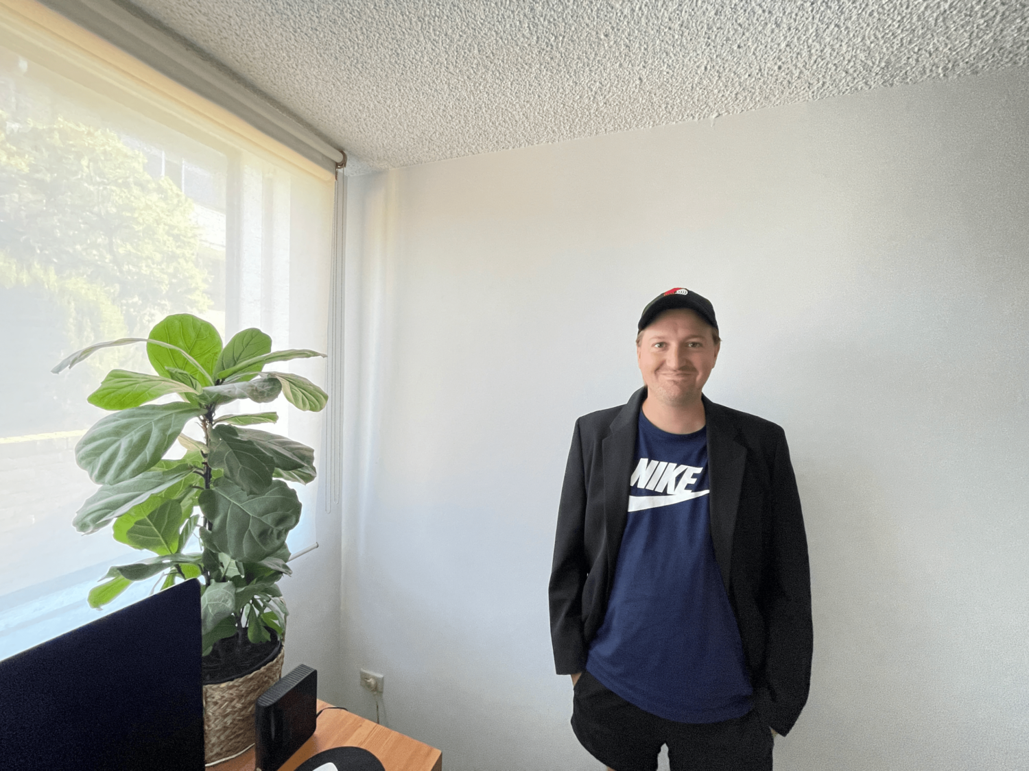
Use a white wall or a solid coloured wall as your background. White or grey or something neutral. I mean go for hot pink if that’s your vibe. But think about your personal brand and make sure the colour vibes with it. Pink is totally my brand vibe though:

Make sure the wall is completely empty, no power points or anything distracting. Or if there are, remove them in Photoshop later.
If you can’t find an empty wall with the right light, chill Mummy. You can cheat and cut out the background in Canva.
Using artificial lighting for your headshots:
If you don’t have studio lights on hand (I mean who does) use the lights around you. Look for soft light sources (the larger the light source the softer the light). Like a fluorescent light or a light that is diffused.
Some things to watch out for – modern lights like LED can throw off funky colours. Look at the light on you and see that it looks good and not a weird colour. Some LEDs are better than others.
Fluorescent lights can throw up funky colours too. Watch for that. The reason is a little complex but fluorescent light cycles. You need a shutter speed slow enough to capture the full cycle but you don’t have my control over that in smartphone cameras. Look at the picture after you’ve taken it and see if the colours look normal/good.
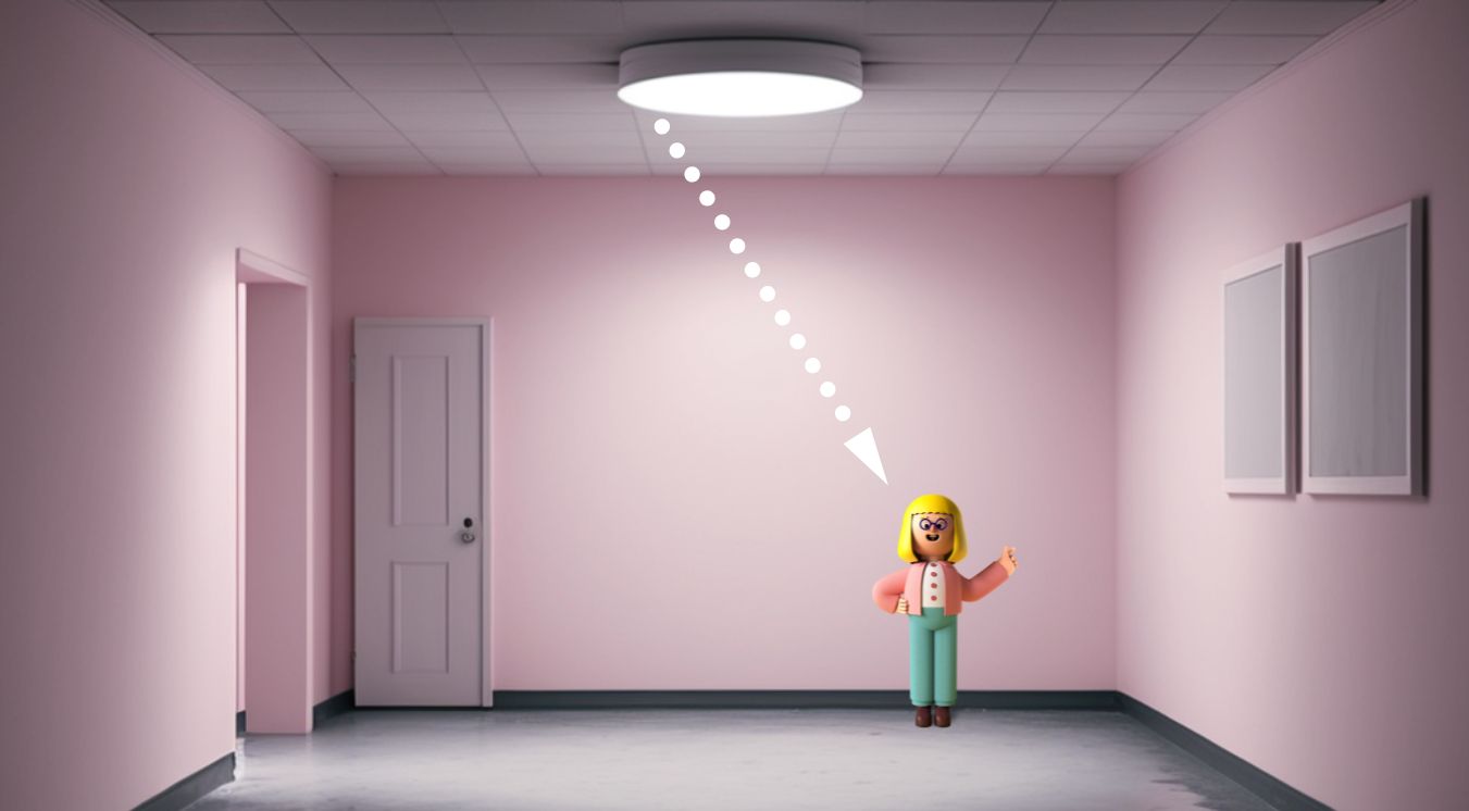
Now place your large soft artificial light source at a 3/4 angle above and in front of you with a simple background behind you. Again think Rembrandt lighting. Make sure there’s nothing to create harsh shadows.
3. Camera! (setting your camera up for your DIY headshot):
If you don’t have a professional camera, don’t worry. Good lighting and your smart phone camera will do the job. Let’s talk 3 things:
Clean yo lens:
Always always always. You can’t get a sharp image with a dirty lens. Don’t get fancy – just fog the lens with your breath and use a bit of soft cloth (t-shirt is fine) or a tissue. Done.
Use the right lens in your phone:
Modern phone cameras often have many lenses. Mine has 3. DON’T USE A WIDE ANGLE LENS. Why? It will distort your facial features and give you a big nose. You’ll look like a Pixar character! Nobody got time for that.

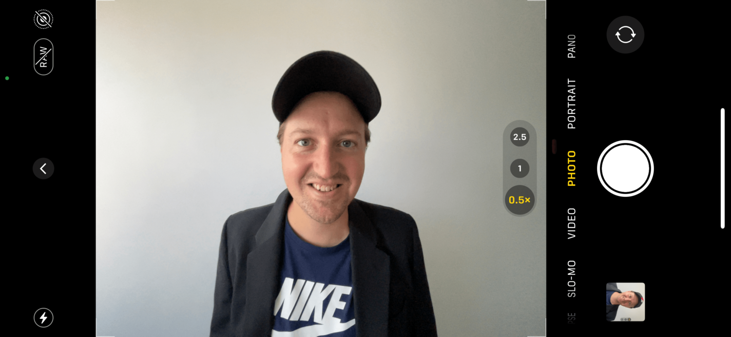
So which lens should you use? If you have a telephoto lens on your phone, use that. If a friend is taking the picture, get them to stand further back or if you are using a tripod, set it further back.
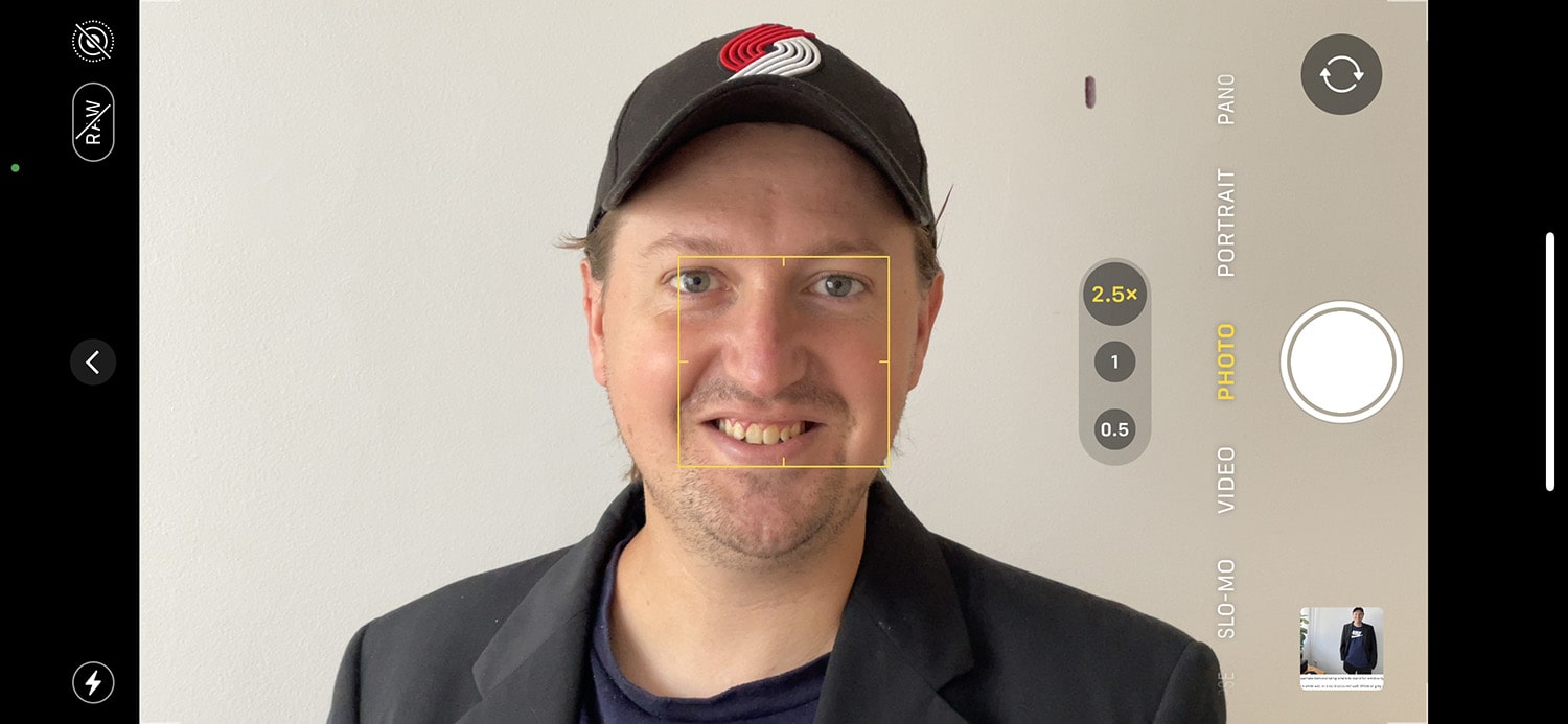
See the difference? So much better on the telephoto camera setting. Apologies to any Android users but the principle is the same whatever camera you are using.
You’ve got a few options for capturing your DIY headshot. The easiest being getting a friend to take the shot. You could also get a cheap tripod. I wouldn’t recommend doing a selfie. It might work if you have a very long selfie stick but chances are it would look a bit awkward. There’s also the previously discussed issue of wide angle lens close up.
You could also prop your camera up on some books or something and do a timer on selfie mode. But the front facing camera on your phone is better quality than the selfie camera.
Don’t use portrait mode on your camera settings. It can do weird things to your face with over the top lighting effects and fake blurring which isn’t a good look for a professional headshot.
4. Action! (direct yo self in your headshot):
Get your friend or a family member to take a lot of photos. Keep it fresh by moving occasionally. If you stay in one position with a smile it will start to look a bit forced after a while.
If a friend or family member is taking the photo – get them to stand still and hold the camera steady.
Mix it up – stand with your body on a 3/4 angle to the camera and your head facing camera. Keep you body loose but confident, strong back. Imagine a string pulling you through the top of your head. Do a few with your body facing left, then front then right.
Find things to do with your hands. Put them in your pockets if you have them. Fold them loosely in front of your body. Pay attention to your hands make sure they are loose and not tightly clenched.
To get a natural smile try a few things. Firstly do a pretend laugh. Like laugh out loud. It might feel weird but usually you’ll feel silly then a real laugh will follow. Get your friend to keep taking pictures through it all.
You can also try poking your tongue out at your friend. You’ll probably both giggle and you’ll get a nice natural smile. You always want nice natural facial expressions. The best headshots are always natural.
5. Editing your headshot:
Go through the photos you’ve taken. Look for a photo where the composition is good, you look good and you have a nice natural facial expression. If there aren’t any – take more photos.
Use a light touch for all editing and filters:
If you have Photoshop skills now is the time to use them. I suggest keeping any editing very light. Especially if it’s used professionally. Don’t use photo editing apps like Facetune. They blur your face like crazy and don’t look natural. Some camera phones already add some blurring.
It’s ok to use a little colour filter but look for natural looking ones and dial back the intensity. VSCO have some good ones for smartphones. Avoid overly saturated filters.
Desaturate a little – especially darker skin tones:
Digital cameras usually have a lot of red in the skin tones. I recommend desaturating your photo in the camera app a touch. Especially for darker coloured skin tones. Why? Darker tones are always more saturated with colour. Don’t overdo it though. Always a light touch.
If you know some Photoshop a little teeth whitening can be helpful. There’s also a lot of apps and online tools for that. But again, always dial back the intensity so it looks natural.
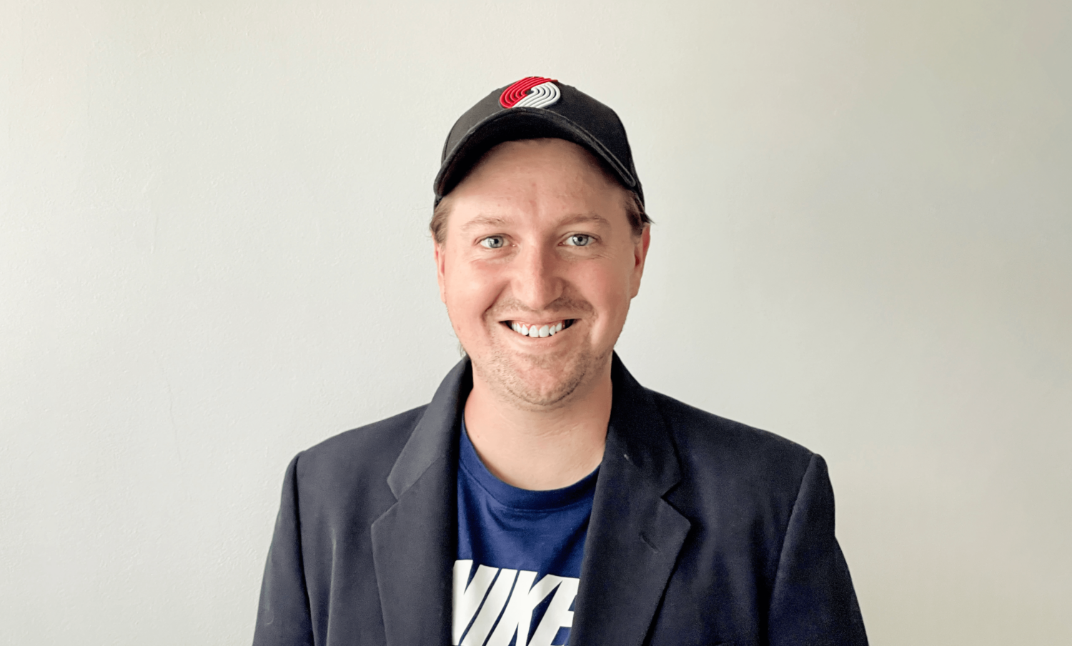
A giveaway to bad editing is overly white teeth, crazy skin smoothing and weird skin tone. You don’t want any of that. Hopefully you’ll end up with something like this:
Cut the background out in Canva for a super clean look:
Another thing you can do in Canva is cut out your subject and put it on a clean white background. Or any colour really. Especially if the headshot background is cluttered. You’ll end up with a really clean, fresh look. Removing a background in Canva is a snap. Upload your photo then click Edit Image top left then Background Remover:
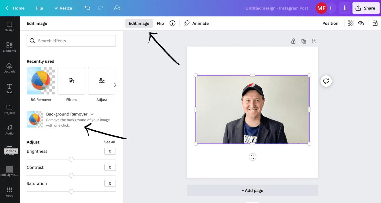
You can now experiment with different colours in Canva. Go wild but make sure any colours fit with your brand vibe.


And there you have it! Not bad for a quick phone camera photo hey?
I’ve used a crop for square profile photos as most social media sites use a square crop and turn it into a circle (LinkedIn for example). Make sure your face is right in the centre of the square otherwise it will be off centre on your profile picture.
I’d love to see what you come up with. Tag me on instagram @photoform_gram and I’ll cheer you on.
And of course if you are in Melbourne and ready to take your professional headshots or personal branding photography to the next level – give Photoform* a shout.
Oh and if you need doggo walkies or daycare in Melbourne – give Patrick a yell at Pks Pack. He’s the one in the examples wearing a cap.
Published by
Myles Formby is an award winning headshot and personal branding photographer based in Melbourne. He is the founder of Photoform*.
His work is technically precise and full of life. He has developed a reputation for extracting natural performances on camera from anyone.
He has worked as an editorial and fashion photographer and has a deep understanding of colour and lighting.
He's been published in Vogue and worked for national brands like Westfield and JB Hi-Fi.
Copyright Myles Formby Photoform* 2025. All rights reserved. Unauthorised use of images and content is prohibited without prior written permission.
share this post