Tips for your LinkedIn profile picture in 2023

LinkedIn is a powerful tool for building a personal brand. Your LinkedIn profile picture is the gateway to your profile and it’s essential you get it right. If your goal is to build an audience and become an expert in your field, you need to stand out. LinkedIn has roughly 875 million users so you want to grab people’s attention. The 2 main tools to do that are you profile picture and headline.
I recommend hiring a professional photographer, especially if you want to be a LinkedIn power user and build a personal brand. I get it though, if you’re a start up with not a lot of cash to splash around, hiring a photographer can be expensive.
Lucky for you I have a second best option on my blog: DIY your own headshot.
Step 1: Think about your personal brand and make sure your photo represents that.
Thinking of yourself as a personal brand means making every touch point is consistent and on brand and on message. If you don’t know what your brand represents, take some time to develop it. There’s a lot of resources on the internet.
A simple way to do that is to distill the essence of your brand into one word. If I distill my business to one word? Fun! With that in the back of mind I can easily make sure everything I create is on message. Yours doesn’t have to be fun. It could be precise, genius or any other adjective you can think of.
Your LinkedIn profile picture should be an accurate avatar of your personal brand. If you’re a shy type, it doesn’t make sense to have a picture of you shouting for example.
Step 2: Decide on a style for your LinkedIn profile picture.
My LinkedIn profile picture is black and white with a pink background. The pink is one of my brand colours. I chose black and white because I’m a photographer. It’s a subtle inference that it’s about my client’s photos, not me.
Have a browse of LinkedIn and screen shot some profile pictures you like. Think about what works. If the person is in your area you could even reach out and ask them the photographer.

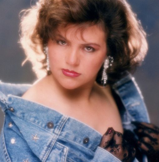
Headshots in 2023 should be clean with a focus on the face with simple lighting and plain backgrounds. Heavily textured backgrounds and overly complicated light setups are very dated.
LinkedIn profile pictures we love:

Chris is a creative director at a creative agency and his LinkedIn profile picture reflects that. You could easily distill his personal brand into one word – creative!

Jessie works in human resources for fashion centred businesses. She wanted her LinkedIn profile picture to reflect that.

Will is an architect and his profile picture signals that. The plywood background hints at building materials and design.
Step 3: Choose a photographer.
Easier said than done. Do a Google search or ask your network for recommendations. Understanding what makes a great photo takes experience and a good eye. But there’s things you can learn to watch out for when researching your photographer. You can start by asking the following questions:
Does the photographer’s website look professional and regularly updated? Do the photos on the website look sharp and in focus? Are the images small and pixelated? Or are the photos so big a page takes forever to load? Does it feel like the website was made with passion and love?
Do you feel an emotional connection to the photos on the photographer’s website? Are the images fresh and modern looking or dated? Is the lighting flattering? Do the people in the photos look good?
And if you’re in Melbourne, then you can book Photoform*. Come on, you don’t begrudge me a little plug?
Step 4: Making image selections.
Unless you’re a trained image professional, I strongly suggest you ask for and listen to your photographer’s selection recommendation. Science shows we aren’t objective when looking at photos of our own faces.
When it comes to making your image selections, a friend or your photographer will choose a more flattering photo than the choice you will make.
I see this just about every day. I scratch my head over the image choices some clients make. And the reason they don’t pick the strongest image is usually some weird reason. For example, they might think their eyebrows look crooked or some other random reason. Trust me absolutely NO ONE is looking at (or cares about) your crooked eyebrows.
I recommend taking your photographer’s image selection over a friend. Though your friend doesn’t have the image bias you may have, they also don’t have years of training. I’ve been editing and choosing images for about 20 years. Like anything you do a lot of, you get pretty good at it.
Step 5: Optimise your profile picture for LinkedIn.
Make sure the photo you choose is in focus and sharp. And make sure it’s the right size for LinkedIn. Though LinkedIn will resize images, their reduction algorithm is heavy handed and it’s best if you do it first.
A LinkedIn profile picture recommended size is 400 pixels by 400 pixels in 2023. Recommended sizes do change occasionally, so do a Google to get the current sizes for whatever social platform you are using.
If you use Photoshop you can re-size your profile picture in that, or you can also do it in Canva.
LinkedIn profile pictures are circles, so crop your image to a square first. Make sure your eyes are in the centre of the image. Make sure you aren’t chopping your head off in some weird place. Also make sure it’s not cropped in too tight, that the image has a little room to breathe.
Step 6: Visually connect your profile picture to your LinkedIn background image.

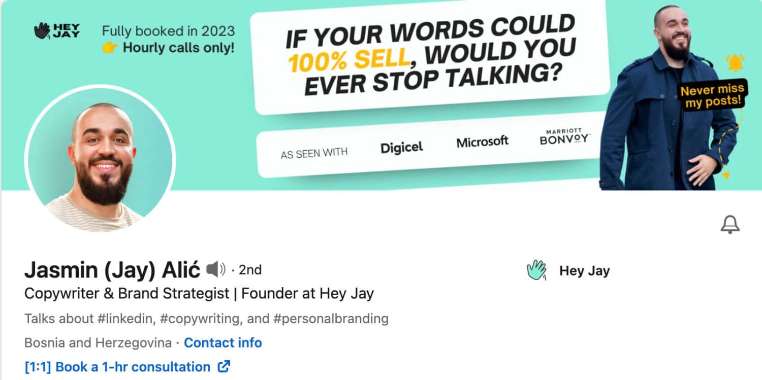
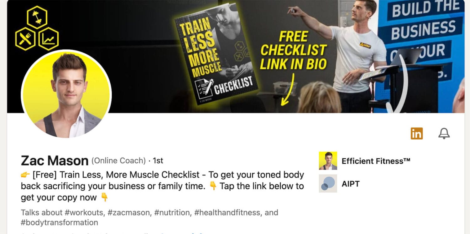
Use your LinkedIn profile to tell your personal branding story. You can see my background photo connects to my profile picture. It uses my business branding colours, it shows some of my work and it highlights some of my top clients. And it stands out.
Think of your background image as another piece of online real estate to tell more of your story. Use your brand colours. Make it look good and tell people what you do. Quickly and simply.


And that’s it. If you’re in Melbourne and you want to elevate your online presence with personality driven headshots, clicky click on the image below!
Copyright of all images (except where credited to other photographers) and text belongs to Myles Formby of Photoform*, 2023.
Published by
Myles Formby is an award winning headshot and personal branding photographer based in Melbourne. He is the founder of Photoform*.
His work is technically precise and full of life. He has developed a reputation for extracting natural performances on camera from anyone.
He has worked as an editorial and fashion photographer and has a deep understanding of colour and lighting.
He's been published in Vogue and worked for national brands like Westfield and JB Hi-Fi.
Copyright Myles Formby Photoform* 2025. All rights reserved. Unauthorised use of images and content is prohibited without prior written permission.

share this post