Pimp your Showit site with custom CSS and spinning text
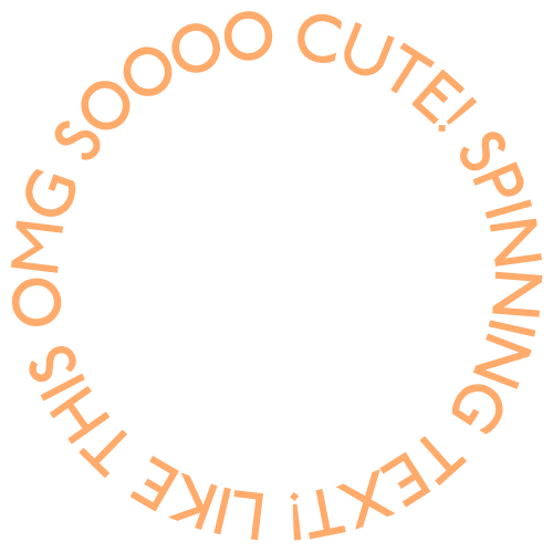
At the end of this blog post you’ll be able to do this with custom CSS code.
The short and cute story of Photoform*
But first a bit of my website journey. Feel free to skip to the lesson I won’t be sad – much. I mentioned in my first blog I built my site in Showit. It was a painful, sad journey to Showit, but luckily with a happy ending. Everyone loves a happy ending am-I-right?
The original plan for my website was to be super clean and modern. I even bought a domain – The Modern Headshot. Written in Helvetica, because that’s about the most clean and modern typeface around. I ran the name by a friend and he suggested it was limiting. The more I thought about it, the more I realised he was right. I want to be more than just headshots. See this friends – I can admit when I’m wrong. So then began the naming evolution until I chose Photoform*.
Next name up was, get this, Golly Photo. I’m sorry what in good God was I thinking? Luckily I came to my senses only to come up with this next gem – Photo Slut. Say what? There’s a backstory, bear with me. I was hired by a mag to photograph the Sydney Gay and Lesbian Mardi Gras way back in 2008. I had a friend assisting so I had 2 t-shirts printed with, you guessed it – Photo Slut. Written large in pink writing on black t-shirts. The party was a hoot, but that’s another story. I told you I easily go off track.
So I did seriously consider Photo Slut for a hot minute. I thought it would be memorable in a ‘so bad it’s good’ kinda way. Buuut, I decided I’d rather be remembered for quality work, boldness and professionalism than a gimmicky name.
Which brings us to the final name – Photoform*. My surname is Formby. My sister had a graphic design business called ArtForm. I thought that works, why not Photoform* and it stuck. The asterisk is a little design flourish I stuck at the end. Mainly because I like the way it looks, and there is a precedent – Wallpaper* Magazine. It’s been a divisive little flourish, let me spill the tea. Some friends hate it, some love it. Honestly, I’m still not 100% sold, it can look cumbersome with a period after it. What do you think? Let me know in the comments.
So evolving right alongside the name was my brand design direction. Don’t get me wrong, I love minimal and clean. But I decided on a fun look with mad colour. Like if a Unicorn crossed with a Rainbow Bright Doll (remember them?) and vomited rainbow glitter, that’s the vibe I was aiming for. Because a brand should be the essence of the creator yeah? That’s me, full of colour.
Photoform* + Showit = Love
Soooo, back to how I ended up using Showit. I started using a WordPress template – Elementor. Elementor has its fans for good reasons, but I found it an exercise in frustration. The learning curve is steep and I have big ideas but little patience. As my plans for the site became more elaborate, I realised Elementor was not going to cut it. So I moved on to Divi. After many more frustrating weeks (same issues as Elementor) I gave up again and luckily I found Showit.
In Showit I found my forever home. Think ‘Adobe type blank canvas’ with unlimited potential to let your imagination run wild. Want an asymmetric banner? Done. Want your own typefaces, animations and colour palette? Done.
CSS animation in 2 steps. Step 1 – add CSS code to page header
Which finally brings me to the point of this blog post – animating images with custom CSS. I was obsessed with some spinning text I saw in Jenna Kutcher’s website. If you’ve got some time, go check out her site. She’s a literal queen and genius when it comes to growing your social media, building a brand and just becoming an all round better person. If you’re reading Jenna, hey I’m a fan!
First up – I’m not expert at coding. Truth be told I don’t even really know the difference between CSS and HTML. Ok I think CSS is the stuff that styles HTML in webpages? Don’t get all up in the comments telling me I have no idea. I know I don’t!
Animating your image has 2 steps. Step 1 is to inject custom CSS into the header of the page you want the animation to appear.
In Showit, go to PAGE>ADVANCED SETTINGS. That’s where you’re going to put the header code. As shown below.
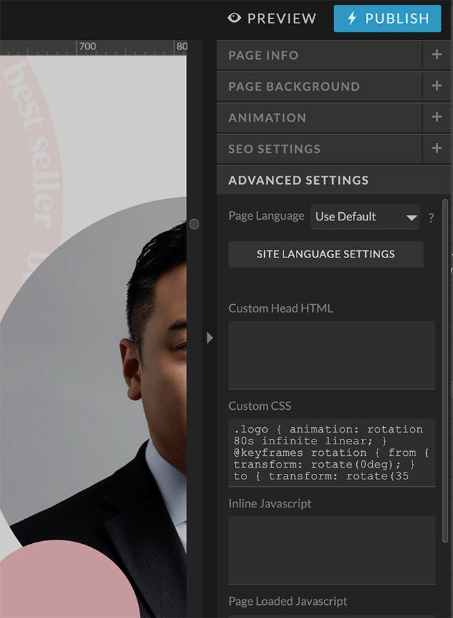
Copy and paste this code into the Custom CSS section:
.logo {
animation: rotation 80s infinite linear;
}
@keyframes rotation {
from {
transform: rotate(0deg);
}
to {
transform: rotate(359deg);
}
}
Basically this code is defining a class which is .logo and then the second bit of code is animating it with keyframes. Play around with the settings like time (80 seconds above) but this is your starting point. You can also see in the code the image will rotate from 0 degrees to 360.
Btw, there’s million different animations you can use in addition to rotate. Check out this awesome site, Animista for a whole bunch of animations.
Step 1 done, tick. Step 2, upload whatever element you want animated into your Showit site. Or any website for that matter. Strictly speaking we aren’t actually animating the text, we’re animating an image of text. I created a circular bit of text in Canva and saved it as a transparent PNG. I’ll show you how to do that in another post but it’s super easy. Important – get your sizes right because you don’t have control over that once it’s in your site. You might need to play around with a few sizes to get it right.
Step 2 – add an embed code box to your Showit page
Next step, add an Embed Code box in your site wherever you want to element to appear. In my page below you can see I’ve put the spinning element on top of a price section in my packages. If you want to see how it looks, have a look at my page:
https://photoform.com.au/headshot-information
This where you put the code:
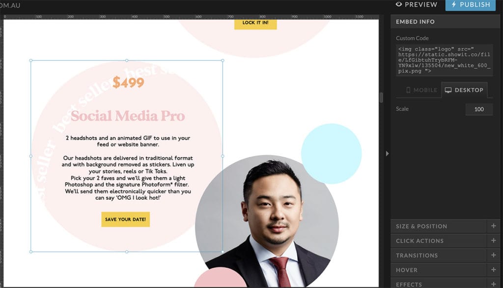
Use this code to start. You’ll be inserting the image URL later for your image file.
<img class=”logo” src=”URLforYourImageFileGoesHere”>
Ok now go into your Media Library in Showit. If you haven’t uploaded your image do it now. Then in the top right of your image thumbnail click on ‘copy link’ like below.
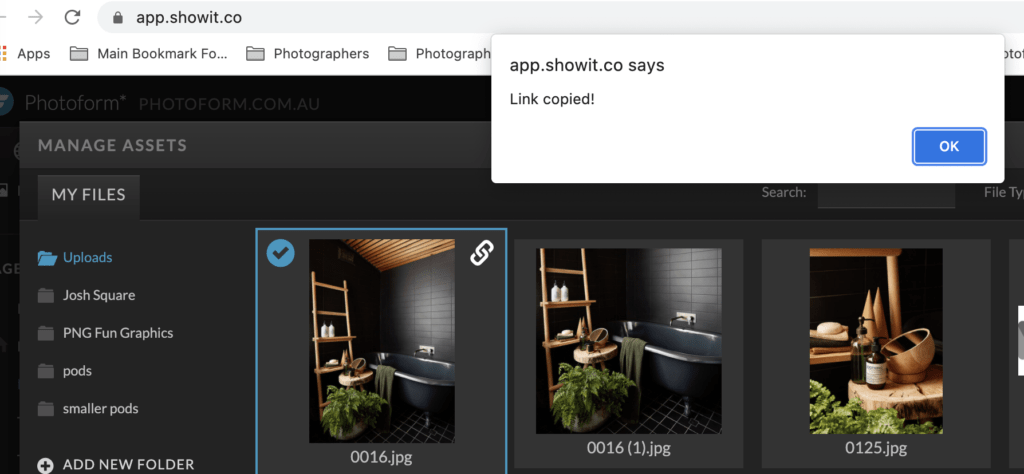
Now go back into your Showit page and paste the URL into the embed box into the section that says “URLforYourImageFIleGoesHere”. Make sure you keep the inverted commas.
EDITORS UPDATE – VERY IMPORTANT!
I’ve noticed a bug or glitch in Showit. When you paste the above code into the embed box in Showit and save it, for some reason 2 sets of quotation marks are added to the “logo” and “URLGoesHere” sections. I don’t know why and can’t get a solution from Showit.
The only workaround is to delete all 4 sets of quotation marks and re-type them ALL in. Do this step AFTER you paste the URL of your image file. There should be 4 quotation marks total (2 sets).
And BOOM! That’s it. You now have an animated text image.
Let your imagination run wild, you can use this technique in so many ways.
In the banner image the little soap pods are PNGs and they are all animated individually. Don’t even get me started on how long that took – omg. Oh one last point, in Showit you need to make a smaller file of the animation for the Mobile view of your site. And repeat the steps we discussed.
And that’s it. Until next time chook,
Myles
Published by
Myles Formby is an award winning headshot and personal branding photographer based in Melbourne. He is the founder of Photoform*.
His work is technically precise and full of life. He has developed a reputation for extracting natural performances on camera from anyone.
He has worked as an editorial and fashion photographer and has a deep understanding of colour and lighting.
He's been published in Vogue and worked for national brands like Westfield and JB Hi-Fi.
Copyright Myles Formby Photoform* 2025. All rights reserved. Unauthorised use of images and content is prohibited without prior written permission.
share this post