
What are the best colours to wear for headshots?

Colour is a powerful tool in image story telling and branding. It’s one of the first things I discuss with new clients who want to know the best colours to wear in headshots. I work really hard on photoshoots with clients to make the colours cohesive.
I’m going to divide this post into 2 parts depending on the answer to the question: “What are the headshots for, will they be on a website and if so, do you have a brand colour palette yet?”
I like to take a step back and approach colour holistically, from a whole of brand perspective. The best colours are the ones that look good on you, and work cohesively with your brand colour palette, if you have one.
If the headshots are not for a business website and are for LinkedIn or whatever, then you won’t need to worry about matching them to a palette and you can think about the colours that will work together as a suite of images.
What are your brand colours?
If you’re starting a business and you haven’t thought about this, get onto it. It doesn’t have to be complicated. But the sooner you start, the sooner you will be able to create a cohesive looking brand and business. It’s the first question I ask clients when we are planning their headshots.
Many times I’ll see clients come and get their headshots done then go and speak to a designer and build their website. It’s really useful to have an idea of brand and website design before you get the headshots done. Why? Because we will have an idea of the look and feel best suited for your portraits.
It would be a shame if your website ends up being dark and dramatic navy tones and your headshots are done in a light and airy style in baby pink, for example.
If you are DIYing your own website, do a little research and pick a colour palette before you get photography done. Think about your brand ‘persnality’ and pick colours to match. Canva have some great resources for amateur designers looking for tips on picking brand colours.
If you want to see a masterclass on matching headshot and personal branding colours to your brand and website, check out Jenna Kutcher’s super fun website. In it you will see she has cleverly used her brand’s colour palette in every photo, matching and sometimes contrasting the clothes colours to her brand palette.
What are you wearing?
After the brand colour palette question, I’ll always ask the client what they are planning to wear and then make background and location choices from that. I like to make sure the pictures work cohesively as a suite of images. Like an editorial, they should work as a set.
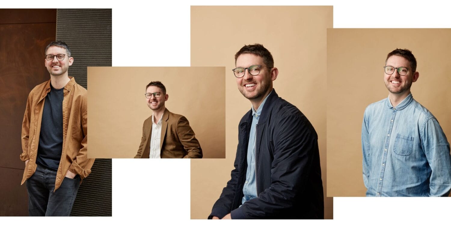
If I don’t think the colours will work, I’ll guide them on better choices. Though I don’t believe there’s any ‘correct’ colours for headshots there’s some things that should be avoided.
Things to avoid for headshots.
Fine stripes, patterns or checks that cause moiré. What’s that? It’s an optical illusion that happens on screens. And it looks like this:
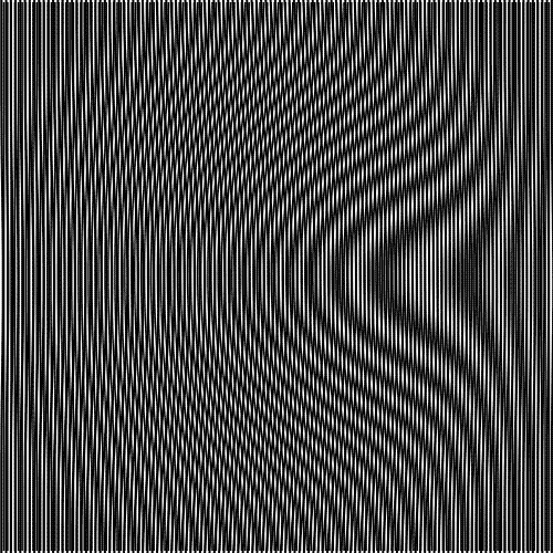
But don’t panic if you have an absolute fave jacket with fine stripes. There are workarounds in Photoshop.
The other things I’d avoid are busy patterns. Solid colours tend to work better. Of course there are no absolutes in any creative pursuit. You might be highly skilled at mixing and clashing patterns, but the average person isn’t.
I also advise against neon colours like yellow or acid yellow/green unless you have really dark colouring that can pull it off.
Oh and super shiny fabrics like satin don’t work well on camera.
Match the background colour to what you’re wearing.
I see some headshot photographers will work off the colour of your eyes or hair or skin tone for picking background colours. While sometimes these things can help guide my decision, I always use what you’re wearing as a starting point. For example, for a client Dr Steph said she was going to wear a deep burgundy jacket and I knew the olive background would work well with that.

If you’re wearing a strong colour and I can’t find a background colour to match or contrast, a neutral background colour will always work – white, black or grey.
Safe colours.
To answer the question of what are the best colours for headshots? Short answer? There really are no ‘best colours’. But there are safe or foolproof colours.
White, black and greys are safe. And then if you pick a different brand colour for your business down the track, the colours won’t clash.
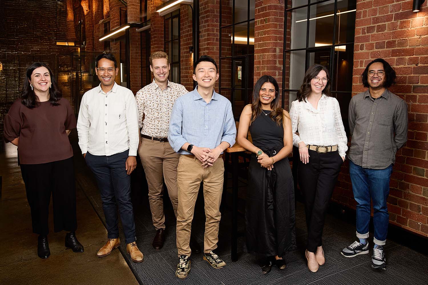
Neutrals are a safe bet too. And if you’re doing a group photo I send the colour swatch below for clients to use to coordinate their outfits.
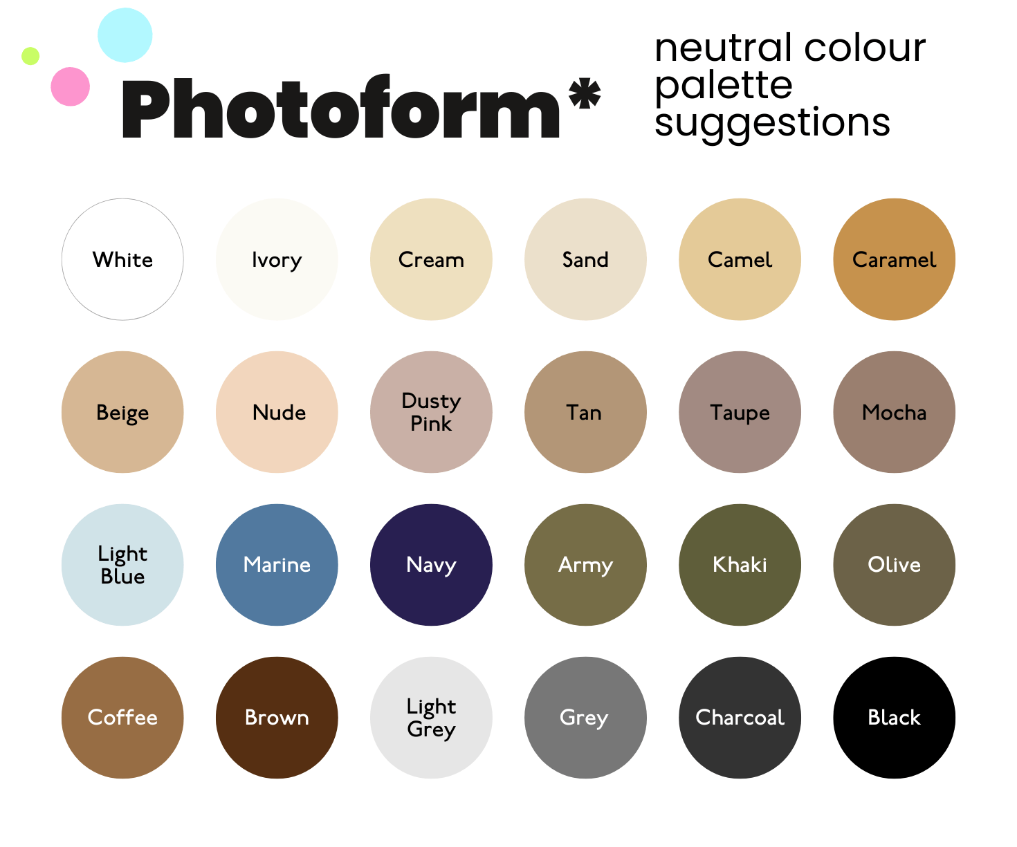
I sent this neutral colour palette for a work team’s group photo and they followed it to the letter. See how everyone is wearing something different and a different colour, but it’s cohesive as a whole?
Denim is fool proof too, everyone looks good in denim.
Conclusion.
- There are no ‘best colours’.
- Start with the intended use for the photos and work from there.
- Match or contrast colours to wear to a brand colour palette if you have one.
- Make background decisions based on what you are wearing.
- Avoid fine stripes, checks or patterns that may cause moiré.
- Avoid neon colour like acid yellow, green or pink.
- Avoid busy patterns.
- If in doubt stick to neutrals.
Published by
Myles Formby is an award winning headshot and personal branding photographer based in Melbourne. He is the founder of Photoform*.
His work is technically precise and full of life. He has developed a reputation for extracting natural performances on camera from anyone.
He has worked as an editorial and fashion photographer and has a deep understanding of colour and lighting.
He's been published in Vogue and worked for national brands like Westfield and JB Hi-Fi.


Ready to level up?
Own the room before you walk into it with our headshots and personal branding photography.
Just fill out the form and you're one step closer to a new you online.
Or give us a call below.
Email us:
Copyright Myles Formby Photoform* 2026. All rights reserved. Unauthorised use of images and content is prohibited without prior written permission.


share this post